HTML5 doesn’t have that? Hey, there’s a custom web component for it!

I’ve been on a custom web component kick for the last few months. Why? Let’s go into some background on that…

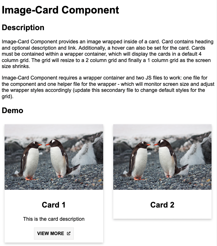
MSU’s College of Natural Science is currently in the process of migrating from one CMS to another. The reasons for doing so I won’t go into, but the process has revealed the need for some custom functionality that won’t be in the new CMS on Day 1. At this point in time I haven’t had any training on the new CMS, that is actually coming in the next month or two, so creating custom functionality in our new system isn’t even an option for me yet. So, I’ve had to turn to custom web components.

image-card component
Image-Card Component screenshot
Continue reading “HTML5 doesn’t have that? Hey, there’s a custom web component for it!”

When you want to fill the space…CSS Grid it!

Graduation is upon us once again in higher education, and for another year, it is taking place online (though there are some in-person ceremonies for those that would like to attend – while social distancing of course). What does an online graduation celebration look like? For the College of Natural Science, along with many of the other colleges on campus, it looks a lot like a custom website. Let’s take a look at one specific feature of the NatSci graduation site, the use of CSS Grid.

Screenshot of the NatSci graduation website Student Highlights page
Continue reading “When you want to fill the space…CSS Grid it!”

The Website Redesign Process: Part 5 – Rounding out the pages

In Part 1 of this Website Redesign Series, we took a look back at the old web design for the College of Natural Science at MSU , and where I was able to bring the design to during a redesign that began in 2016. In Part 2, we looked at some data points that analytics were showing us, and talked about how those would affect the redesign of the college homepage, and then sketched out what a proposed homepage redesign would look like. In Part 3, we took a look at the technology I’d be using to build the new design. In Part 4, we took a look at the work in progress for the homepage design, along with some issues that were encountered and how those were remedied. Here in Part 5 we will be taking a look at the remaining page designs, and the thought behind them.

As noted in Part 4, in addition to the homepage design, I needed to come up with designs for:

  • Section Front page – a page devoted to the primary areas/categories/buckets of the website. Generally speaking, these are the pages that appear in the primary (top) navigation bar.
  • Secondary page – a page devoted to providing information. Generally speaking, the majority of pages on the website will be of this page type.
  • News Article page – a page devoted entirely to news articles

Each of these pages will have a hero image/banner at the top, and the content area will be split into two columns for desktop view (left column for content, and right column for secondary navigation or any related content), and a single column for mobile view (content first, followed by secondary navigation/related content below it).

Continue reading “The Website Redesign Process: Part 5 – Rounding out the pages”
The Website Redesign Process: Part 4 – A work in-progress

In Part 1 of this Website Redesign Series, we took a look back at the old web design for the College of Natural Science at MSU , and where I was able to bring the design to during a redesign that began in 2016. In Part 2, we looked at some data points that analytics were showing us, and talked about how those would affect the redesign of the college homepage, and then sketched out what a proposed homepage redesign would look like. In Part 3, we took a look at the technology I’d be using to build the new design. Now here in Part 4, we will be taking a look at the work in-progress, issues I’ve encountered, and what some resolutions have been to those issues.

Just to recap from Part 3, I decided to go with CSS Grid over a front-end framework. Now you might be thinking to yourself, “But Jesse, IE doesn’t fully support grid!”. And you’d be right, but based on our analytics, less that 3% of our website visitors are using IE. In fact, over 90% are using Chrome or Safari.

Continue reading “The Website Redesign Process: Part 4 – A work in-progress”

The Website Redesign Process: Part 3 – The Technology

In Part 1 of this Website Redesign Series, we took a look back at the old web design for the College of Natural Science at MSU , and where I was able to bring the design to during a redesign that began in 2016. In Part 2, we looked at some data points that analytics were showing us, and talked about how those would affect the redesign of the college homepage, and then sketched out what a proposed homepage redesign would look like. In Part 3 here, we will take a look at the technology we will be using to build the redesign.

Before we talk about technology though, let me explain a bit about my design process (something that is different for everyone). I like to start with a mockup, which is what you saw in Part 2, and from there, I like to start designing right in my browser. WOAH, WOAH, WOAH! WHAT? DESIGNING RIGHT IN THE BROWSER? BLASPHEMY! Or is it?

Continue reading “The Website Redesign Process: Part 3 – The Technology”

The Website Redesign Process: Part 2 – Data driven design

In Part 1 of this article series, we took a look back at the old web design for the College of Natural Science at MSU , and where I was able to bring the design to during a redesign that began in 2016, with an implementation that occurred in 2017. Part 1 concluded by indicating that our analytics were helping to drive the next iteration of the design that I’ve now embarked on…but how is it doing that?

Just to recap from Part 1:

  • The college homepage has more visits than any other page on the site.
  • Nearly 3/4 of the traffic seen every month is reported as a “New User”, as opposed to a “Returning User”.
  • The largest demographic is in the age range of 18-24, followed closely by 25-34.
Continue reading “The Website Redesign Process: Part 2 – Data driven design”

The Website Redesign Process: Part 1 – A look back

It’s that time again…time to redesign a website!

In my current role as the Digital Media Manager for the College of Natural Science at Michigan State University, which also encompasses front-end design/development for the college, the responsibility of a website redesign falls into my lap.

When I first took this role back at the end of 2016, my first official project was to develop a new design for the college website. The website at that time looked like this:

Old NatSci website design
Continue reading “The Website Redesign Process: Part 1 – A look back”

The story of James & Forms

When people think of web accessibility, most tend to only think about those who are blind and require a screen reader in order to navigate a website. The question that often comes to mind for website owners is, “Is my website accessible via a screen reader?”.

There are many impairments however that can affect a person’s ability to navigate a website. Some of these include:

  • Visual Impairments: low vision, color blindness
  • Hearing: deaf, heard of hearing
  • Physical: motor, speech
  • Cognitive & Neurological: learning disabilities, memory impairment, seizure disorders

Meet James…

Continue reading “The story of James & Forms”