
When people think of web accessibility, most tend to only think about those who are blind and require a screen reader in order to navigate a website. The question that often comes to mind for website owners is, “Is my website accessible via a screen reader?”.
There are many impairments however that can affect a person’s ability to navigate a website. Some of these include:
- Visual Impairments: low vision, color blindness
- Hearing: deaf, heard of hearing
- Physical: motor, speech
- Cognitive & Neurological: learning disabilities, memory impairment, seizure disorders
Meet James…

James is a sophomore student at a Big Ten University. He is from Southfield, Michigan, studying Sociology, and has career aspirations of becoming a guidance counselor. James is like most college students, trying to learn as much as he can while also taking time to relax and enjoy the college life. Like many people, you wouldn’t know it by just looking at him, but James suffers from a disability – tunnel vision.
Wikipedia defines tunnel vision as, “loss of peripheral vision with retention of central vision, resulting in a constricted circular tunnel-like field of vision”.
What this means for James is, seeing for him is like looking through a straw, where he can only see a small area in his central vision in both eyes, while everything else around that central area appears black. Because of this, James must navigate the web with the use of keyboard and mouse, monitor, and sometimes even a screen reader.
Let’s rewind a bit. Leading up to his senior year in high school, James began applying for college. He applied to 5 different colleges in total, and ultimately chose one of the Big Ten Universities.
Most colleges and universities have an online application process. And while each process is different depending on the institution, they all generally use an online form to begin the application process. Form layout can have a significant impact on how easy or hard it is for a user (in the case of James, a prospective student) to fill out and complete a form. There are many different form layouts as well: vertical, horizontal, single column, multi-column – all create a vastly different user experience.
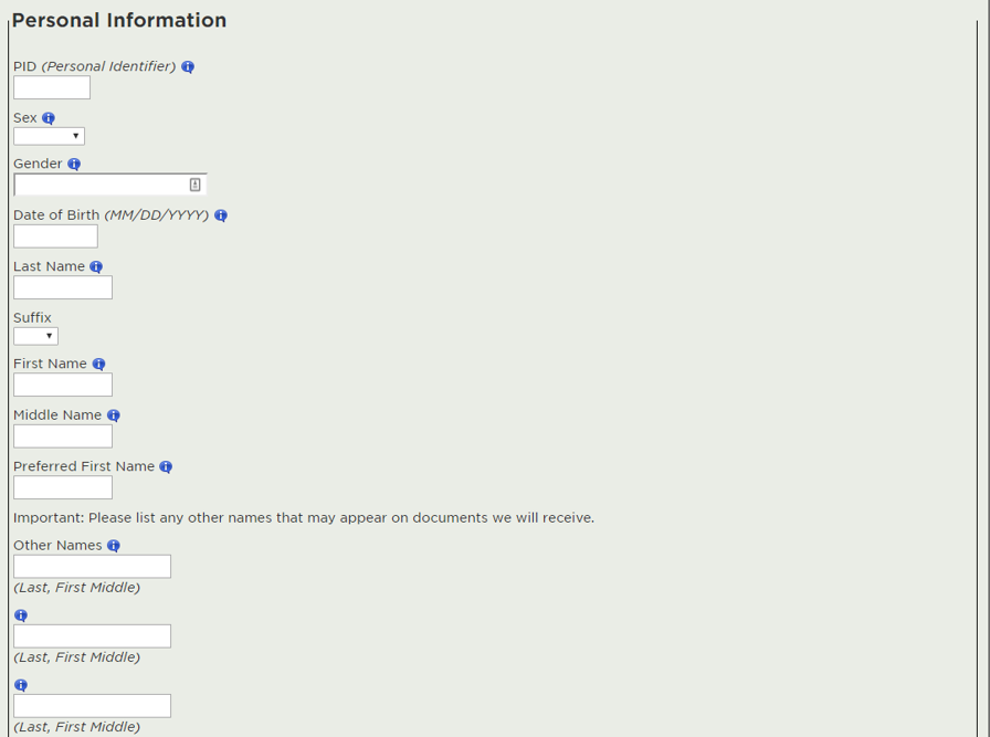
As James started the online application process, he came to the first screen of the online form that collects personal information.

This form type is a combination of multi-column and vertical. How do you navigate this type of form? According to Baymard Institute, an independent web usability research group, users will generally navigate multi-column forms in one of five different ways…

For James, someone who suffers from tunnel vision, he was navigating the form using method two in the diagram. In this method of form navigation, James was only going down the left side of the form, completely missing form fields in the center and the right part of the screen. For James, he couldn’t help it, he was navigating based solely on sight, and his point of view was limited, he simply did not see the additional columns of form fields.
There are countless articles out there on the web that go into detail on form design, there are even books written entirely on the subject, so I won’t go into detail here. However, there is a much easier way to present the application form so that it’s accessible to not only James, but everyone that fills out that form, and that is by redesigning the form layout to be a vertical single-column form.
By taking the same form and simply eliminating the columns, all of the form fields are now left-aligned on the form. Had the form been presented to James in this manner, he would have had no issue filling it out on his own. In fact, presenting the form in this manner makes it far more accessible to everyone, as you only have to visually scan up and down, and there is no mistake about how you should navigate this form when filling it out.
I’ll leave you with some questions as you mull over the redesigned form…
- Is the James in this story a real person?
- And while you’re thinking about whether James is real or not, ask yourself this: Does it matter?
Whether the James in this story is real or not, there are people out there that are just like James, and they may be having the same exact issues with the forms on your website.
Remember…
- Good form design makes it easier for everyone to navigate and complete a form, not just those with visual impairments.
- Good form design may be the difference in attracting and retaining a customer (in the case of this story, a prospective student), vs. losing them to a competitor.
- Good form design should be applied to any type of form (applications, contact us, registration, etc.)
About the author
Jesse Earley
Jesse Earley is a front-end designer/developer currently helping to shape the future of the web at the College of Natural Science at Michigan State University as a Digital Media Manager.