
In Part 1 of this Website Redesign Series, we took a look back at the old web design for the College of Natural Science at MSU , and where I was able to bring the design to during a redesign that began in 2016. In Part 2, we looked at some data points that analytics were showing us, and talked about how those would affect the redesign of the college homepage, and then sketched out what a proposed homepage redesign would look like. In Part 3, we took a look at the technology I’d be using to build the new design. Now here in Part 4, we will be taking a look at the work in-progress, issues I’ve encountered, and what some resolutions have been to those issues.
Just to recap from Part 3, I decided to go with CSS Grid over a front-end framework. Now you might be thinking to yourself, “But Jesse, IE doesn’t fully support grid!”. And you’d be right, but based on our analytics, less that 3% of our website visitors are using IE. In fact, over 90% are using Chrome or Safari.
So back to the work in-progress. I developed a single wireframe mockup for the homepage of the college site:
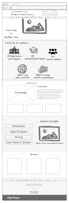
but it should be noted, this is not the only page I’m designing for. In addition to a homepage, our website will also be using:
- a Section Front page – a page devoted to the primary areas/categories/buckets of the website. Generally speaking, these are the pages that appear in the primary (top) navigation bar.
- a Secondary page – a page devoted to providing information. Generally speaking, the majority of pages on the website will be of this page type.
- a News Article page – a page devoted entirely to news articles.
Each of these three page types will be a 2-column layout, with the primary content appearing in the left column, and side-navigation/secondary content appearing in the right-column. Each will carry the same header and primary navigation bar, along with the same college and university footer. Each page will also have a hero image/banner area at the top. This isn’t much different from our current implementation, so a mockup wasn’t needed for these. Besides, this is where designing in the browser can be fun!
It should also be noted that as I began building out the homepage (and the others), that I was thinking about the elements that would need to be dynamic or user selectable, and how that content would need to be added to the page. For example, the hero image at the top of the page would be a “featured” news story, so I had to think in advance for how a content editor would go about selecting it as such. Additionally, if the content editor wanted to instead display a video in this area, I had to think about that workflow and how I was going to reconfigure the markup ( programmatically) to allow that to work. This won’t be covered in this article, but I was writing some pseudo code as I went along so that I could later translate it into the language used by our CMS when it came time to actually implement the design.
Without further ado, let’s dive into the breakdown of the homepage from wireframe to inception.
The Homepage
The Homepage design allows for the most creative freedom. My goals with the homepage are:
- Provide a fresh and modern look
- Provide marketing information on the homepage, since the majority of our visitors are reported as “New User” and the homepage is the most visited page
- Surface the top relevant links on the homepage
- Highlight students, since our largest demographic is in the 18-24 range
Let’s start dissecting the work in-progress.
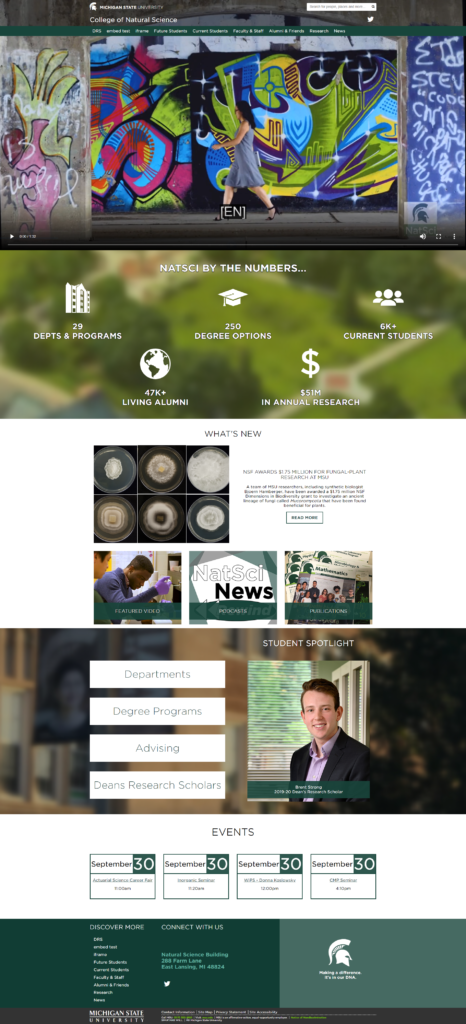
Here is a screenshot of the top of the homepage. This encompasses both the header and the hero section
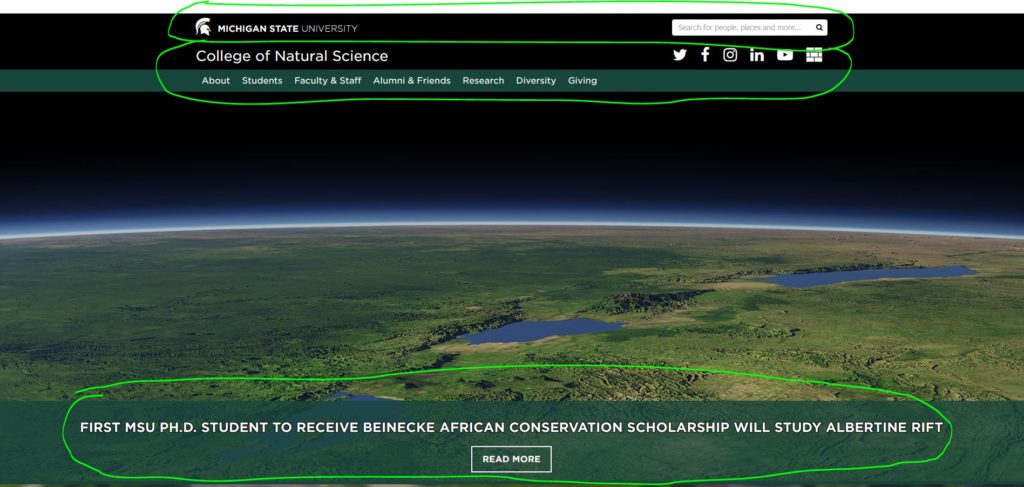
The first circled area in the image shows the official MSU Header. This area consists of the Michigan State University wordmark and search. This is a requirement for every MSU website. Below that is the college header area, which consists of the college name, college social media icons and the primary (top) navigation. The last portion of this area consists of a featured news article, whose relevant image takes up the entire hero area, and includes the news article title and a “Read More” button. When compared to the mockup at the beginning of this article, I’d say I pretty much nailed this one.
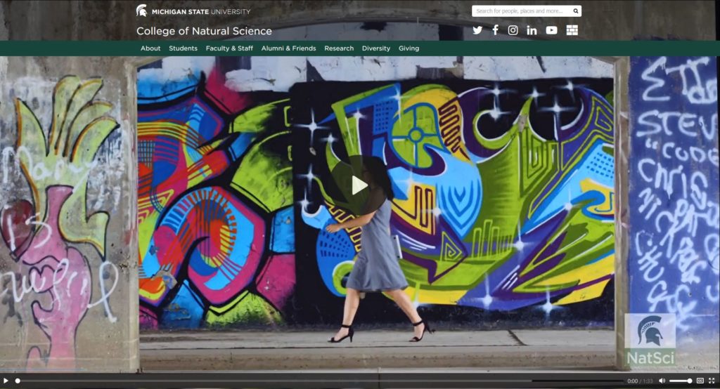
The other thing that had to be considered for this area was swapping out the news article for a video. Here is a screenshot of the same page, but now with a video. In the case of the video, I am using the native HTML5 <video> element (which also supports captions for accessibility!)
Moving down the page we next hit what I call the “Marketing Area”.
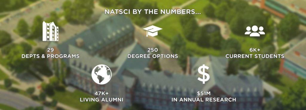
This area, with a heading of “NATSCI BY THE NUMBERS…”, highlights “who” we are and “what” we have to offer as a college. The icons are custom SVG’s that will change color on hover (final colors for hover have not yet been determined). The advantage of using SVG’s over icon fonts here is that SVG’s can be multi-colored, unlike an icon font that can only be a single color. This area also features parallax scrolling, with a birds-eye view of the Natural Science building in the background. We have another section that is pretty close to the mockup above.
Below this area is the “What’s New” section of the site:
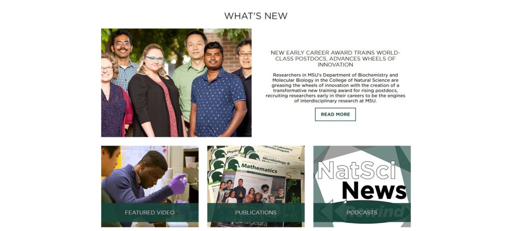
This section of the homepage features lots of whitespace. This area is also a carryover from the current design, but reconfigured and presented in a much more user friendly way. The top area consists of the most recent news article (which is different from the ‘featured’ news article at the top of the page). Additionally it also includes the title of the news article, the summary of the article, and a “Read More” button. Below this area are highlights of additional content that’s updated on a regular basis, including: featured video, publications and podcasts. When comparing with the mockup, you’ll see that this area is pretty close to what I originally envisioned.
Below this area is the student focused section of the homepage, which includes the most visited page links and a “Student Spotlight”.
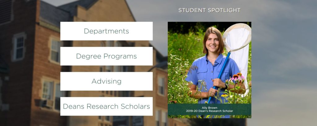
I wanted to call attention to the links, so those took precedent over the image for the desktop view (this is flipped for mobile view), and is why they appear on the left (and why they are also large). On hover, the background of these link buttons animate to green, with a wipe from left to right as the text turns white. The “Student Spotlight” area, once implemented into a theme for the content management system, will feature a random student image from the Dean’s Research Scholars. Another area that is close to the mockup. If you wonder why I keep mentioning that, just wait till we get to the footer, you’ll see.
Below the student focused section, rounding out the homepage before we get to the footer area, is the events. This was also a carryover from the current design, but I wanted to present them in a more eye-catching way.
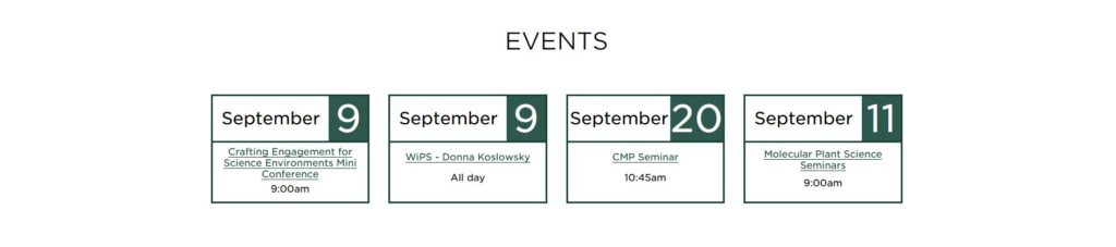
Four events are listed in a 4-column format. For mobile view, this changes. As the screen shrinks down, they go into a 2×2 grid, before finally changing to a 1×4 grid for even smaller screens. You’ll note that mockup consists of three events rather than four, but with the available space on the screen, presenting a fourth event only made sense.
Up to this point, most every section of the homepage has been close to the original NinjaMock wireframe. This is where things start to change. Let’s take a look at the footer.
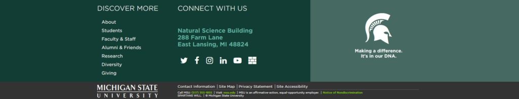
The wireframe for the footer consisted of a centered row of navigation (which was a repeat of the top-level nav links), followed by a centered row of social media icons, followed by a centered Spartan helmet, followed lastly by the MSU Footer (which is a requirement on all MSU websites). This approach had an inverted pyramid aesthetic, that looked ok in the mockup, but didn’t translate well over to a real-world design. The primary reason for this was because the mockup didn’t include the full text of the MSU Footer. When that text was in place, the inverted pyramid layout looked terrible. Something had to change. I began looking at some of the other college websites at MSU for some ideas on footer design and layout. While not identical, I started seeing some consistency across sites with a larger footer that not only included navigation, but contact information as well. Using this as inspiration, I reconfigured the college portion of the footer into a 3-column layout. The first column, with the heading of “Discover More”, now included the navigation in a vertical format. The second column, with the heading of “Connect With Us”, now included the address for the college and the college social media icons. The third column now consisted of the Spartan helmet with the college tagline, presented in a larger format to make it standout. Overall, I was actually quite happy with the change, and was one I had to make on-the-fly in order to make it more visually appealing.
So that’s been a look at the work-in-progress for the homepage design, and here is a full-page screenshot of what it actually looks like implemented into our content management system development environment from a desktop viewpoint.
Some things to note here…
- This is how the homepage looks with the video option enabled in the hero area. The video player makes use of a VTT file for captions, and is required for all videos added to the homepage for accessibility compliance.
- The backgrounds of the parallax scrolled section (“WE ARE NATSCI” and “STUDENT SPOTLIGHT”) are not this blurred in the actual implementation. The browser screenshot functionality has blurred each section further.
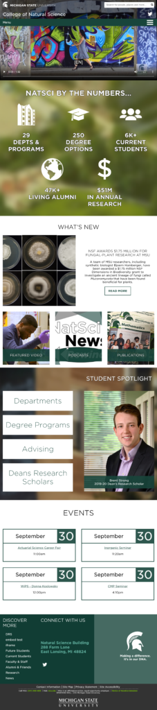
Here are a few screenshots of what the page would look like in two different mobile views:

Stay tuned for Part 5, in which will taking a look at the remaining page layouts and their implementation.