
In Part 1 of this Website Redesign Series, we took a look back at the old web design for the College of Natural Science at MSU , and where I was able to bring the design to during a redesign that began in 2016. In Part 2, we looked at some data points that analytics were showing us, and talked about how those would affect the redesign of the college homepage, and then sketched out what a proposed homepage redesign would look like. In Part 3 here, we will take a look at the technology we will be using to build the redesign.
Before we talk about technology though, let me explain a bit about my design process (something that is different for everyone). I like to start with a mockup, which is what you saw in Part 2, and from there, I like to start designing right in my browser. WOAH, WOAH, WOAH! WHAT? DESIGNING RIGHT IN THE BROWSER? BLASPHEMY! Or is it?
A speaker at one of the An Event Apart conferences that I attended in the past explained that there is no right or wrong way when it comes to the design process, you simply use the tools you’re most comfortable with. Some people like to start from a wireframe mockup and go right into developing a Photoshop comp. Me, I like going from a wireframe mockup straight to designing in the browser, using real HTML and CSS. Why? You can do anything in Photoshop, and not everything translates well over into a physical (or is that digital?) working version of an actual design. I liken it to a blueprint for a house. Growing up, I worked in residential construction with my dad. Sometimes a blueprint would show something that just didn’t work in the physical world, so you would have to improvise. Or sometimes a room would look different on a blueprint until you actually saw the physical studs of the wall and their placement within a room, and then the homeowner may want to change something. The web design process, for me, is a lot like that. Additionally, while I know Photoshop, I’m far more proficient at using HTML and CSS. In the end, you work with the tools you know.
So my design process is going to involve HTML and CSS, but what about a front-end framework? The current design for the College of Natural Science is using Bootstrap 4 and was originally implemented with Bootstrap 3 before being upgraded (the old design used Bootstrap 2), Will we use that here as well? Or what about Foundation? W3.CSS? Materialize? All frameworks I’ve used in the past…but no, I have a different idea in mind for this project.
Don’t get me wrong, front-end frameworks are fantastic, especially for people with little to no front-end design experience or talent. They make your projects look great, while also providing the responsiveness needed to make your project fit on most screen sizes. They generally come with a cost however, and that cost is bloat. If you use the entire library of CSS and JS available to you in these frameworks, you’re tacking on extra page weight for site visitors. A lot of the bigger frameworks (like Bootstrap and Foundation), allow you to pick and choose the modules you want to use (if you choose to go that route), but you still have the issue of customization. Modifying the standard code or styles can present an issue with upgrading from one version of the framework to the next. In the past, I’ve always used the base framework, and layered my own styles on top of it. It does add cost in page weight, but it allows for a much easier upgrade path.
So what will I be using instead? CSS Grid.
CSS Grid is fantastic! If you haven’t used it in any of your projects yet, I would start looking into it. It’s been around for a while now, but support is finally at a level where I feel comfortable using it for a project of my own that will affect thousands of website visitors. So what does CSS Grid get us then?
- The ability to achieve a grid layout without using a bloated framework (the number one advantage in my opinion)
- A flexible system for presenting content in a different manner depending on screen resolution/device type
- Native support right in the browser, so no special code or weird hacks to get this to work
In addition to native CSS, I’ll also be using vanilla JS, which is still needed for some interactions (mainly the navigation at this point). Additionally I’ll be using:
- Visual Studio Code – for coding
- Less CSS (though with the BEM method, regular CSS may be better)
- Grunt – for compilation and packaging
- Git (for version control – in this case a local Git Lab installation)
- Firefox Developer Edition – has fantastic native tools for designing with CSS Grid
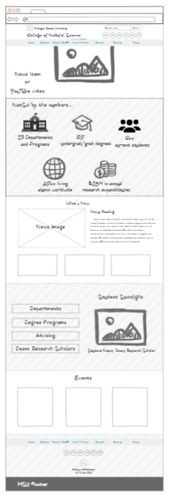
So what’s next? Next it’s time to dive in and actually produce a working prototype of the NinjaMock wireframe that I created:
Stay tuned for Part 4 in which we will take a look at the work in-progress.