
In Part 1 of this article series, we took a look back at the old web design for the College of Natural Science at MSU , and where I was able to bring the design to during a redesign that began in 2016, with an implementation that occurred in 2017. Part 1 concluded by indicating that our analytics were helping to drive the next iteration of the design that I’ve now embarked on…but how is it doing that?
Just to recap from Part 1:
- The college homepage has more visits than any other page on the site.
- Nearly 3/4 of the traffic seen every month is reported as a “New User”, as opposed to a “Returning User”.
- The largest demographic is in the age range of 18-24, followed closely by 25-34.
So what do we do with this information, and how it is going to help drive the redesign process?
Looking at the three points in the list above, one can conclude that students are the primary audience of the college website, most of them are new to the site, and that the information they are seeking should be on the homepage for easy access. Yet if you look at the homepage design as it currently stands:
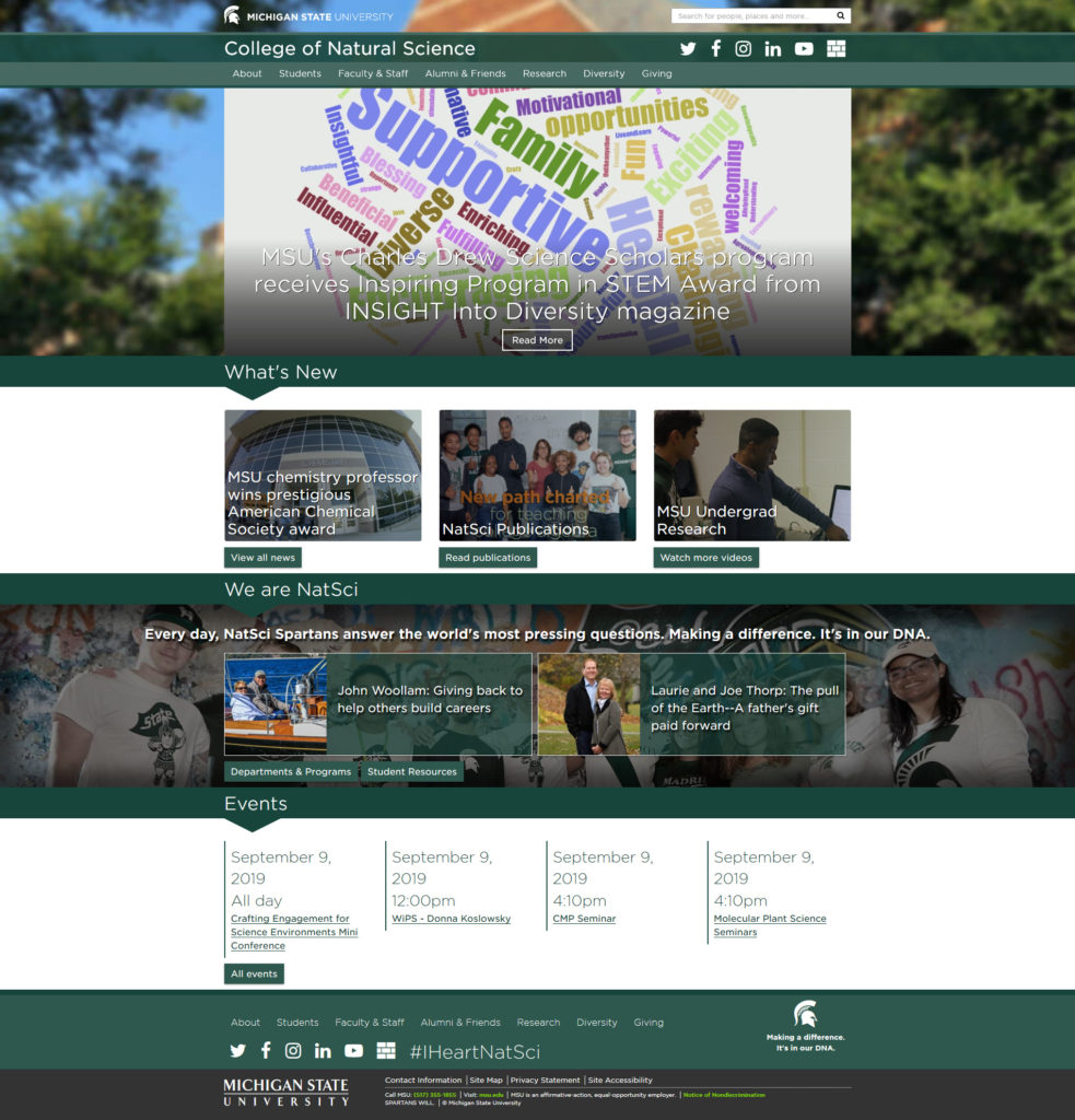
you can see that it is currently failing our primary audience. The top “hero” area houses a featured news item (which most sites do, but this isn’t necessarily student focused). Below that, the “What’s New” section is highlighting news (that may or may not be student focused), digital versions of publications (that students aren’t reading), and a video (that students may interact with, but it’s at the end of the list) . Below that is a “We Are NatSci” section, which does have student focused content via the “Departments & Programs” and “Student Resources” buttons, but the two profiles that are displayed in this area may or may not show students (profiles are randomized on page load, and also currently show alumni as well). Below that are “Events”, which can be student focused, but there’s nothing exciting or eye-catching about their presentation. The page closes out with a reintroduction of the top-level nav categories and social icons with a hastily placed hashtag that was suggested via committee (I lost out on not including that).
With this information in mind, I set out with the primary goal of providing a more marketable driven design, something that would sell the college to our website visitors (remember, most of them are new visitors), while also providing them with information that the Comms Director wants to present to the global college audience and the larger MSU audience, while finally surfacing those top pages that we know students are looking for.
With these parameters in mind, one of my student employees and I began researching and compiling a list of websites that we liked that featured the elements I wanted to bring to this redesign. After a number of meetings reviewing these sites, I settled on specific sections that I wanted to present on the homepage, and then determined what content I wanted where. Now it was time for a mockup!
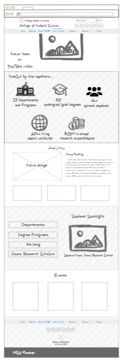
I used NinjaMock (a quasi-free tool) to put together a quick digital sketch of what I saw in my head.
So what does this mockup entail? From top to bottom…
- The “Hero” area would have the ability to display a video or a featured news article that would fill the screen. The site header and navigation would “float” on top of this video/image.
- Below this area would be what I refer to as the “marketing” area of the homepage…what makes us “us”. Here, 5 different facts about the college would be highlighted that would be of interest to prospective students (or possibly even prospective faculty).
- Below that is a “What’s New” section. Yes, this was a hold over from the current design, but the presentation is entirely different. One news item would appear at the top of this section with a large color graphic; the title and summary appearing to the right. Below would be three large graphics, each one highlighting different items that would be of interest to different demographics of site visitors.
- Below that is a “Student Spotlight” section, that would highlight only students within the college, and include links to the top four pages that students are seeking out (based on our analytics).
- Below that is “Events”, which is also a carryover from the current design, except that the events information would be presented in a larger, bolder format.
- The footer, which continues to have the repeated top-level nav items from the primary navigation, would be presented in a much cleaner format.
The modular approach, breaking down the homepage into chunks or sections, would also allow for plugging in a new section in the future (if required).
So I have my mockup, what happens next? Stay tuned for Part 3, in which I’ll be discussing the technology I plan on using.
One Reply to “The Website Redesign Process: Part 2 – Data driven design”