
It’s that time again…time to redesign a website!
In my current role as the Digital Media Manager for the College of Natural Science at Michigan State University, which also encompasses front-end design/development for the college, the responsibility of a website redesign falls into my lap.
When I first took this role back at the end of 2016, my first official project was to develop a new design for the college website. The website at that time looked like this:

This design was heavily inspired by another college on campus, except that it failed to capture the luster of even that design. I knew things had to change. So as I started down the road of a redesign, I looked at what made this design bad:
- The page is multi-column and very cluttered. You have no idea where your central focus should be.
- The “design” was very bland overall, and didn’t scream “MSU” as a brand, and certainly didn’t feel very 2016 in overall aesthetic.
- The pages were built using Bootstrap 2 for mobile responsiveness, but the mobile experience was far from great.
- Not shown here, but secondary pages could have two and sometimes three columns all within the same site, with side navigation that would jump from column-to-column depending on what area of the site you were on (no consistency!)
With these things in mind, I got to work on 3 different mock-ups, using other college websites here on campus as inspiration for trying to get the feel of the brand correct. Ultimately the design that fell out of that process is the design you see below:
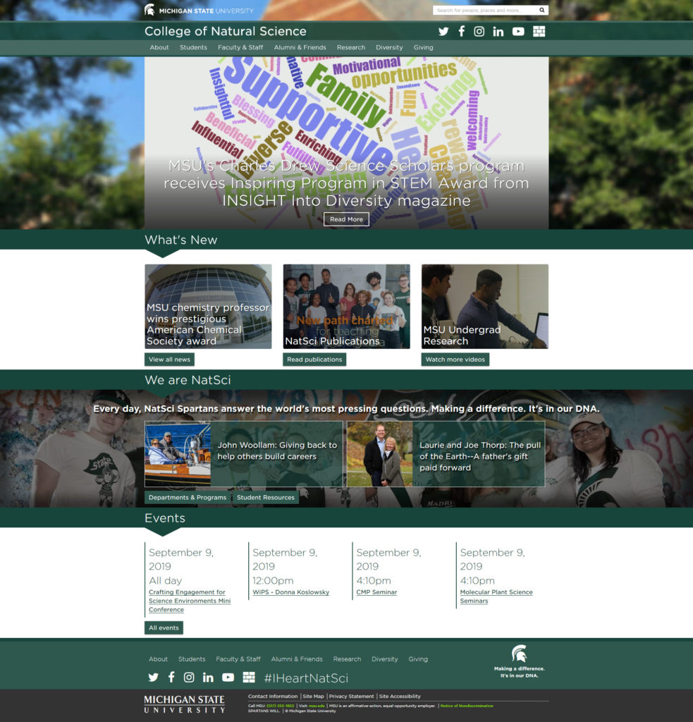
This design was launched in the summer of 2017, first for the college website itself, and then distributed to the nearly 100 department/program websites that the college houses within its content management system. There were several things that I tried to accomplish with this design:
- Branding – If you compare this design with the previous, the redesign is more authentic to the MSU brand.
- Remove the clutter – There is a lot less text on the screen and much larger images.
- Drive people down the page – If you’ve ever worked on a website redesign, you’d probably heard the term “above the fold”…it’s that area of your website that people first see when it loads on whatever device they’re using. The old way of thinking is that if you can get your content in that view, people are more likely to interact with it. While that may be partially true, it’s also important to note that if your content is good enough, people will scroll. The visual indicator (downward facing triangle in the headings) was meant to visually drive the eye down the page from one section to the next.
- Mobile friendly – This redesign used Bootstrap 3, and later was upgraded to Bootstrap 4, for a more mobile friendly experience than what Bootstrap 2 allowed for in the previous design.
- Accessibility – The design was built with web accessibility in mind, ensuring that it could be navigated by using both a keyboard and screen reader.
It has now been almost three years since I first began working on the previous redesign (just over two since it was launched), and it’s time for a new one. No, not just because the design is dated, but because our analytics are telling us so (yes, those numbers can be quite helpful)!
So what exactly are the analytics saying for the college?
- The homepage has more visits than any other page on the site. Quite surprising, especially since in the web of today, everyone is simply using Google to search for content, thus bypassing website navigation altogether.
- Nearly 3/4 of the traffic we see every month is reported as a “New User”, as opposed to a “Returning User”.
- Our largest demographic is in the age range of 18-24, followed closely by 25-34. That shouldn’t come as much of a surprise, those are the general age groups for prospective and current students, but our homepage isn’t doing much to present them with content of interest.
So what do we do with this information? How will it help to drive the redesign process? Stay tuned for Part 2 to find out!
2 Replies to “The Website Redesign Process: Part 1 – A look back”