
In Part 1 of this Website Redesign Series, we took a look back at the old web design for the College of Natural Science at MSU , and where I was able to bring the design to during a redesign that began in 2016. In Part 2, we looked at some data points that analytics were showing us, and talked about how those would affect the redesign of the college homepage, and then sketched out what a proposed homepage redesign would look like. In Part 3, we took a look at the technology I’d be using to build the new design. In Part 4, we took a look at the work in progress for the homepage design, along with some issues that were encountered and how those were remedied. Here in Part 5 we will be taking a look at the remaining page designs, and the thought behind them.
As noted in Part 4, in addition to the homepage design, I needed to come up with designs for:
- a Section Front page – a page devoted to the primary areas/categories/buckets of the website. Generally speaking, these are the pages that appear in the primary (top) navigation bar.
- a Secondary page – a page devoted to providing information. Generally speaking, the majority of pages on the website will be of this page type.
- a News Article page – a page devoted entirely to news articles
Each of these pages will have a hero image/banner at the top, and the content area will be split into two columns for desktop view (left column for content, and right column for secondary navigation or any related content), and a single column for mobile view (content first, followed by secondary navigation/related content below it).
Let’s take a look first at the Section Front. The Section Front page is the landing page for an area. Let’s say for example our primary/top navigation has the following links in it: About, Students, Alumni, Giving. Each of these links would be primary areas of the website, which should have additional child pages under them. Since these are landing pages for these areas, and we know that our visitors like images that help tell a story, we want the hero image to be large on this page. Not quite as large as the homepage, but large enough that it still pulls you in and also keeps the content above the fold. Here is a screenshot of that implementation:
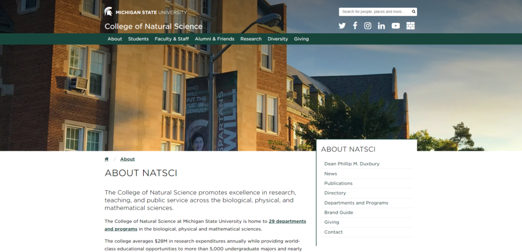
In this case, the page allows for an image that is 1920px x 550px for optimal viewing but has a CSS background-size value of “cover”, so that if the browser window exceeds the 1920px width, the image will still stretch to fill the space.
Next let’s take a look at the Secondary page. Another name for this page could be a “Child” page or “Information” page. Most pages on the site will be of this type. The general purpose for this page type is to present information that the content editor is trying to convey. If a user makes it to this level of pages, the primary focus shouldn’t be on the hero image, but rather the content (which itself could be made up of images). Because of that, the hero image in this case should be much smaller. Here is a screenshot of that implementation:
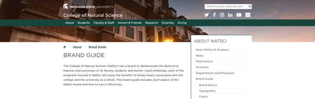
In this case, the page allows for an image that is 1920px x 260px. This shortened height from the Section Front page, pulls the page content up much higher on the page so that the user can more quickly get to the information they need.
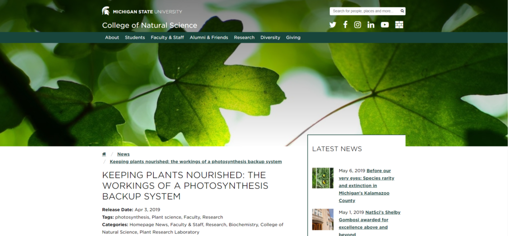
Lastly, we have the News Article. The College of Natural Science releases a lot of news articles in the course of a month. Generally speaking, the majority of them are accompanied by a high-quality banner photo. To help with the visual storytelling, I wanted to ensure that the image takes precedent on the page, so it needs to be big. Having it the same size as the homepage pushed the content too far down, so I went with the same dimensions as the Section Front, 1920px x 550px. Here is a screenshot of that implementation:
The last visual piece to focus on for these page implementations was the right-column. Here is a screenshot of that:

Pulling the right-column up into the hero image provided two things:
- Visual flair – Layering of elements on the page brings with it an interesting visual appeal that isn’t found anywhere else on the site.
- Help with identifying navigation location – With the navigation off to the right of the content, it can get lost from a visual perspective. By raising it up into the hero image, it clearly stands out and can be easily identified when you first hit the page.
To separate it from both the content and the hero image, a small border runs along the left and top of the column. The left border is just long enough to cover whatever content appears int he column, otherwise the remainder of the column is open with whitespace. In responsive view, the border drops off as the right-column is pulled below the left in stack order. Here is a screenshot of that:

And on that note, that wraps up my website redesign series. The screenshots in this article were all taken from the actual implementation of the design into a theme for our content management system (Mura CMS). I am working on fine-tuning and last minute tweaks. I will be rolling out the new design during Thanksgiving weekend, just in time for Giving Tuesday on December 3, 2019. Be sure to check out the new site once it launches at: https://natsci.msu.edu .