
Graduation is upon us once again in higher education, and for another year, it is taking place online (though there are some in-person ceremonies for those that would like to attend – while social distancing of course). What does an online graduation celebration look like? For the College of Natural Science, along with many of the other colleges on campus, it looks a lot like a custom website. Let’s take a look at one specific feature of the NatSci graduation site, the use of CSS Grid.

Before we dive into detail about how the page is working, I want to talk about the design intent. The ‘Student Hightlights’ page on the NatSci graduation site was meant to display a photo (if available), along with information about the student themselves (name, major, additional information – quotes, awards, plans after graduation, etc). It was unknown which students were going to be supplied to the Communications Team from departments and programs within the college, and for those that were supplied, what information would be coming along.
As I started receiving information from the departments and programs within the college, it was very appaernt that the length and amount of information for each person was going to be vastly different. I also knew we were going to be getting a lot of students, so I wanted to pack as much information on the screen as possible to minimize scrolling. I also wanted to customize the look and feel a bit so it wasn’t just photos and text on the screen.
With this information, I started messing around with a card layout. The thought process was:
- If a student has an image, that image will appear at the top of the card
- The student name will appear below the photo (if applicable), otherwise it will be at the top of the card.
- Major will follow the name
- Any additional information provided will follow the major
Knowing I wanted to lay the cards out in a grid fashion, I started working with CSS Grid.
grid-template-columns: repeat(auto-fit, minmax(160px, 1fr));This line of CSS is telling our browser that for the CSS Grid Columns, we want to fit as many columns as we can in the available space (auto-fit), and that at minimum we want the columns to be 160px wide (so they don’t get too small), and up to a maximum of 1fr. I started creating DIV elements to represent the cards with a class of “studentHighlightItem”. This class would not define any CSS Grid column or row values, so by default each one would span one column and one row.

This would be great if I wanted all of the cards to be the same height and width, but I didn’t…remember, some students had far more information than others. So I created a “span2” class and added it to the “studentHighlightItem” DIV’s that had a lot of information. That style rule looks like:
.span2 {
    grid-column: span 2;
    grid-row: span 2;
}
With this class, the container for the students with a lot of information would now span both two columns as well as two rows. This was getting me closer to what I wanted, but there was a problem…it left a lot of empty spaces in the grid.
So why is this empty space there? The empty space allows for another “studentHighlightItem” that is one column wide…but the next “studentHighlightItem” that was added in the markup received the “span2” class – meaning it would not fit in this available space, so it moved on down to the next row. Is there any way to back-fill these spaces without having to manually organize your markup? Yes, there is!
By adding the following style to our grid:
grid-auto-flow: dense;This allows the browser to take any grid elements further down in the markup and move them to available spaces further up in the grid. The end result is a grid layout with less empty space, a grid that is more “dense”.
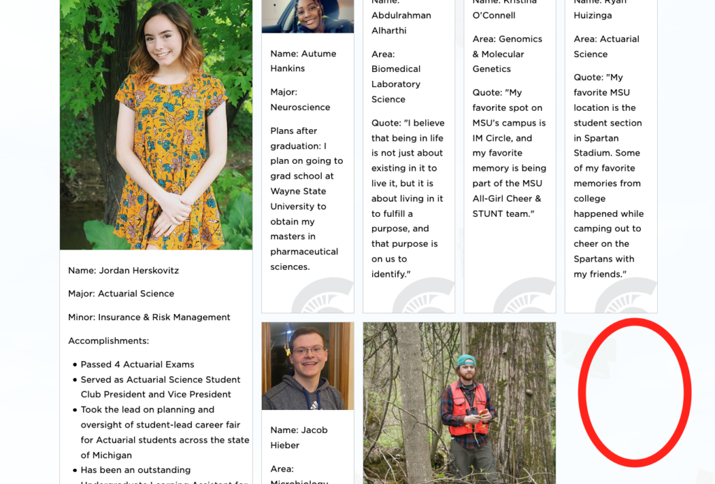
Here is a before:

And here is an after:

If you’re using CSS Grid and don’t care about order, but also want to maximize the available grid space, I highly recommend using the dense value for the grid-auto-flow property.
You can view the live version of the page that the screenshots were taken from here – https://natsci.msu.edu/class-of-2021/student-highlights/