
This is a short story of a GPA calculator. What’s so special about a GPA calculator you ask? Yeah, that’s what I wondered as well…
I work for the College of Natural Science at Michigan State University. There, I work on the Communications Team with the title “Digital Media Manager”, but I am, and will always be, a front-end developer. Luckily, part of my responsibilities in this position fall into the front-end developer realm. As of late, I’ve been on a big kick to let analytics drive design, inform us on content, and how the overall user experience could be improved.
Looking at the analytics for the College of Natural Science website, one of the consistent “Top 3” pages on the site (not counting the homepage, which is always number one), is a page called “Calculating Your Science & Math GPA“. The thing about this page is that it’s boring…extremely so. There is nothing interactive about it, and there are typed out steps, complete with a table, explaining how to calculate your GPA. See the screenshot below…
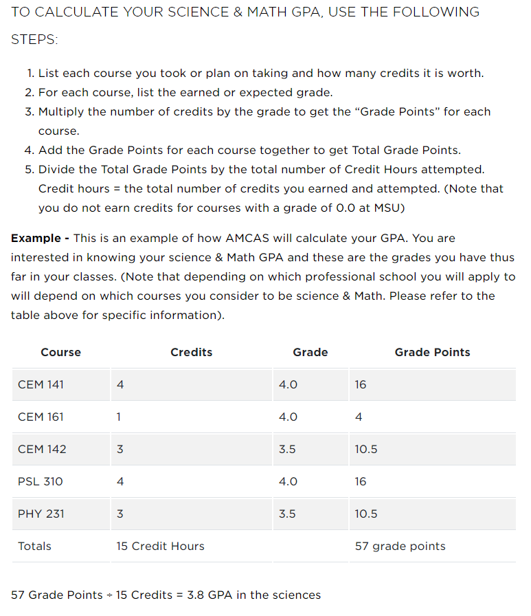
Who would want to read that information? Not me, I can tell you that much. And yet, this page is consistently in our “Top 3”. Not only that, if you search for “calculate math science gpa”, or various permutations of that query, this page is always one of the first links in a Google search. One permutation even has this page as a featured search result. The analytics show that people from all over the world are coming to this page. People must really want to know how to calculate that GPA!
But what if we could provide a better user experience? Why make a student read instructions and then pull up a spreadsheet, or worse yet, a pen and piece of paper, and force them to manually calculate their GPA? Well, I set out to do just that.
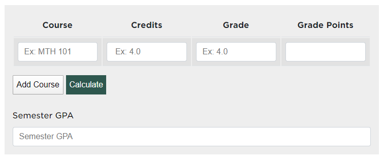
As a front-end developer, my main tools of choice are: HTML, CSS and JavaScript. With those tools, I knew I could improve this experience for our site visitors. I started by creating a four column table with the headings of: Course, Credits, Grade and Grade Points. I added four input boxes (one for each column) and two buttons below that, one to add an additional course and one to actually perform the calculation. At the bottom, I added an additional input box that would display the total ‘Semester GPA’. Simple enough, now time to code.
The final result, which can be found on the Calculating Your Science & Math GPA page, allows a website visitor to add as many courses as they desire. After entering in their “Courses” (which is optional and not required for any calculation), the number of “Credits” that course is worth, and their “Grade” for that course, hitting the “Calculate” button will display the earned “Grade Points” for the course, and the final “Semester GPA”.
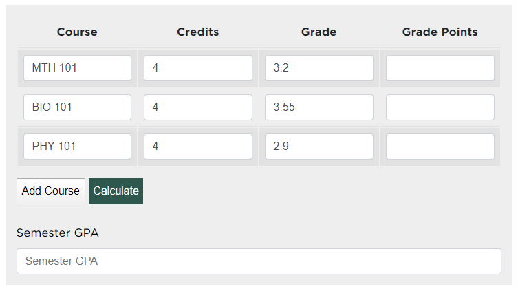
As an example, let’s say I add 3 courses: MTH 101, BIO 101, PHY 101. I enter in “4” credit hours for each. For MTH 101 I enter a grade of “3.2”, for BIO 101 I enter a grade of “3.55” and PHY 101 I enter a grade of “2.9” (I guess I didn’t do too well in that course). The interface would look like this:
Clicking the “Calculate” button gives me the following:
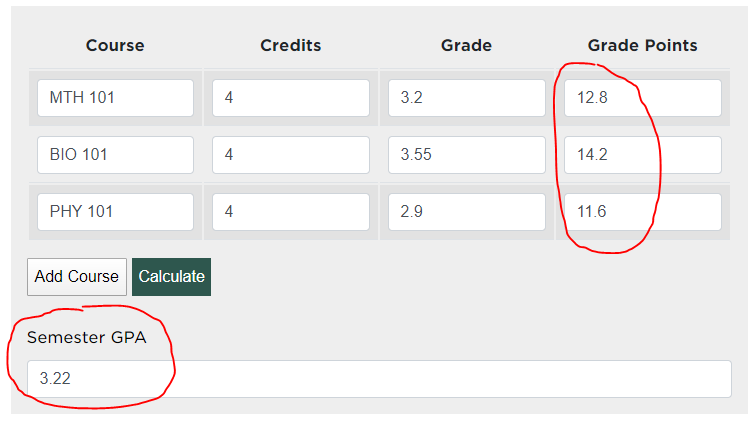
The calculated results gives me a MTH 101 “Grade Point” of 12.8, a BIO 101 “Grade Point” of 14.2 and a PHY 101 “Grade Point” of 11.6, with a “Semester GPA” of 3.22.
In total, the GPA calculator only took me a few hours to build, but the time savings for a website visitor could be great. Couple that with the better overall user experience, and I’d say we have a much better resource on the website now.
Final Thought:
If you haven’t looked at your website analytics to help determine what you should be offering your website visitors, you’re making a big mistake. This GPA calculator addition was a small time investment on my end, but it greatly increased the user experience for our users. I’ve already begun looking at other areas that could be improved by similar tactics, and it’s now a greatly discussed topic of interest in team meetings. Whatever we can do to help improve the user experience should not be overlooked…even if it’s for something as simple as calculating your GPA.